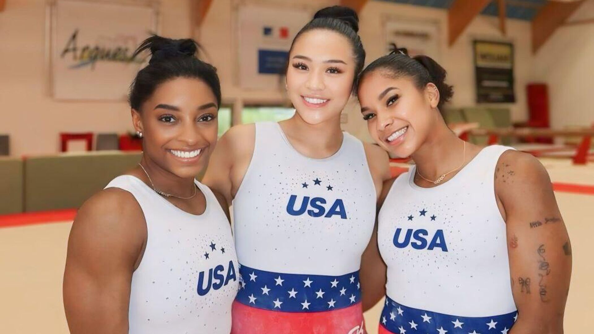
The US gymnastics team, led by Simone Biles, will compete at the Paris Olympics in swimsuits whose design is very reminiscent of the work of a famous Russian designer. Sports is conducting a plagiarism test.
An idea from 30 years ago
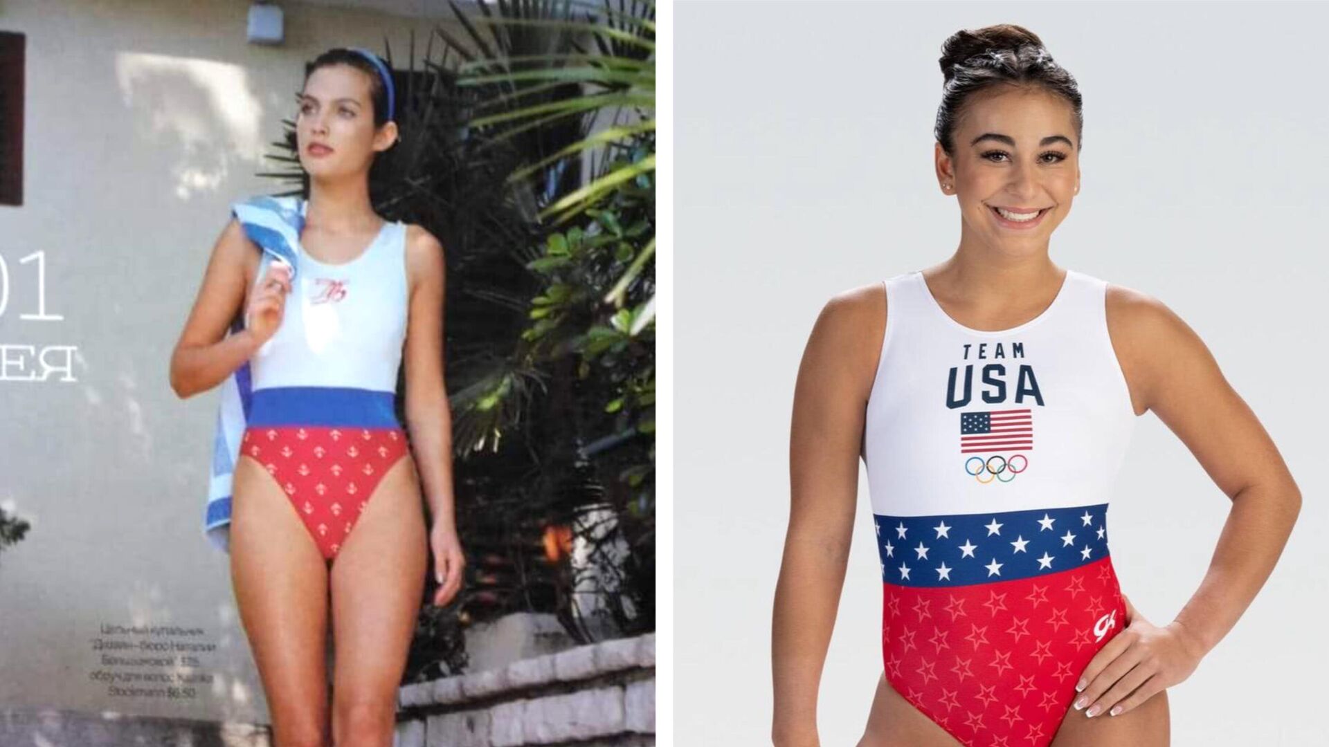
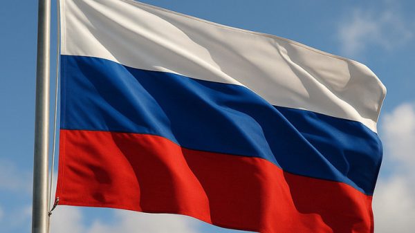
A photo report about the new uniform appeared in the media and social networks of the American women. An interesting fact is that the gymnasts held their first training sessions in white-blue-red leotards, reminiscent of the combination of colors of the Russian flag. This was noticed not only by fans, but also by professionals. Costume designer Natalia Bolshakova, known for her work with Olympic champions in figure skating and synchronized swimming, noted that the product of the GK Elite company (the largest manufacturer of clothing for artistic gymnastics in the United States) resembles her own idea from 30 years ago.
«I have been engaged in small-scale industrial production of swimsuits for a long time. This is a swimsuit from my collection, which was published in Marie Claire magazine (the Russian version of the famous French magazine). There is a caption that this is a swimsuit by Natalia Bolshakova's design bureau, and the price for which it was sold at that time is indicated — I think it was 20 dollars. 30 years ago, this was a lot of money. On the chest is the emblem of my company — NB.
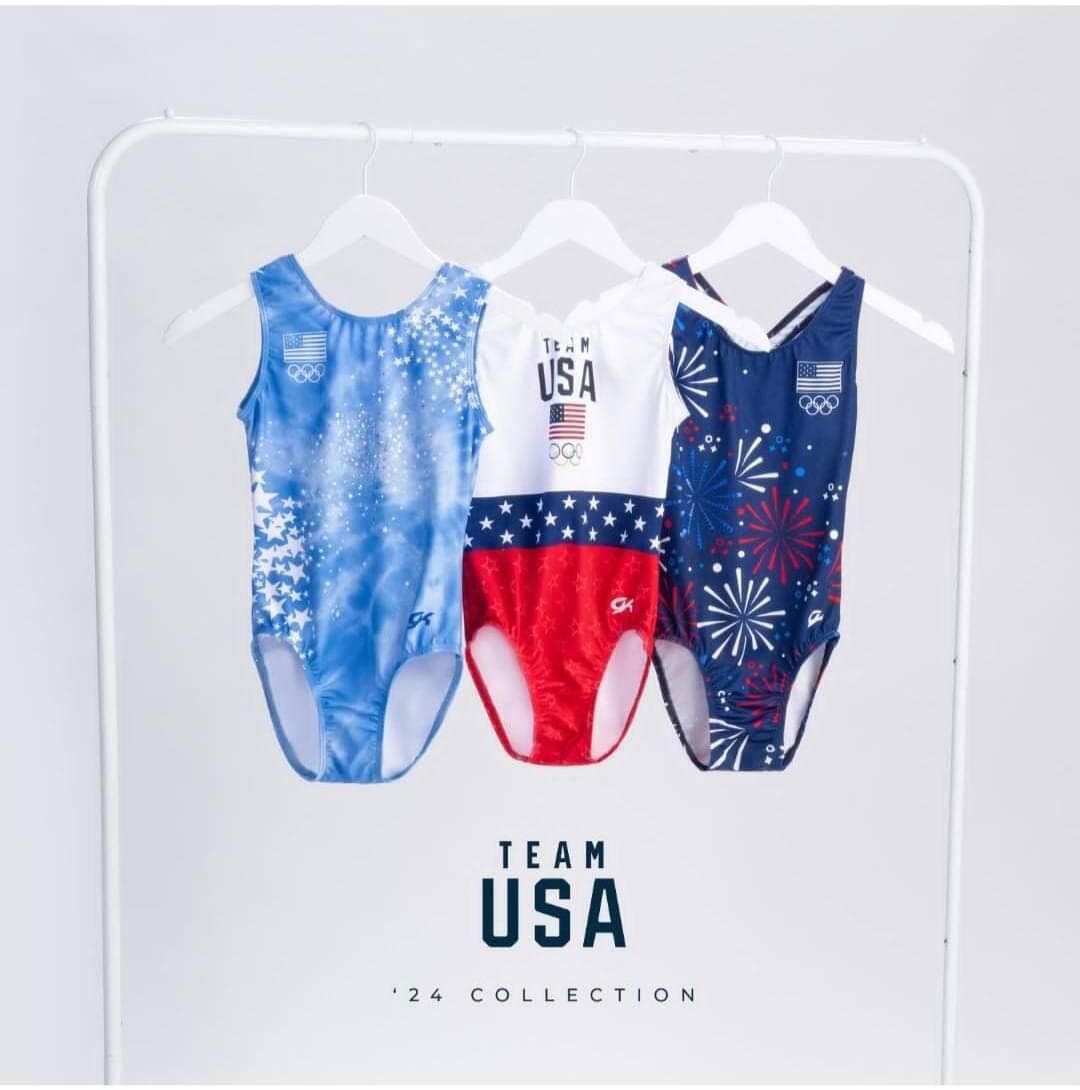
The shape is simple, but the combination of colors and the location of the emblem are characteristic. The idea was obvious — apparently, my years of work at the Sportswear Fashion House outfitting the USSR and Russian national teams had an effect. Some kind of spot is asking to be on a large white surface. I put my emblem, and they put the US team. Moreover, there are different versions in the equipment — with a flag, without a flag,” said Bolshakova.
The leotard (as the gymnastics leotard is called) is actually sold on the manufacturer's official website and costs $50 minus 1 cent — the same as the other models. At the same time, stylistically, its simplicity stands out quite a lot against the background of gradients, rhinestones and other visual effects. And it really is very similar to the leotard from the pages of Marie Claire, which Bolshakova once designed.
Ralph Lauren would never do that
Many would be tempted to talk about plagiarism here. Especially on such a scale: Simone Biles is a mega-popular representative of a mega-popular sport in the USA. But Natalia does not consider this plagiarism and generally treats it with irony:
«
«I'll call it a funny coincidence. Not «oh, they stole it from me.» Copyrights for mass-produced clothing are generally very complicated. They only apply to the design itself, not the color and so on. It's a beautiful idea, and it's nice that I was the first with it. That not only the Russians copy Ralph Lauren, but also the largest American manufacturer of clothing for sports gymnastics copies us,» Bolshakova continues.
Just as there are only seven notes in music, there are seven colors in a rainbow, so some overlaps and unconscious repetitions in design are inevitable. And yet, when it comes to such an iconic story as the official uniform of the national Olympic team, not a single nuance can be neglected. The main task of the designer, in addition to style and convenience, is to make the uniform recognizable. So that it is immediately clear where the Hungarians are and where the Italians are, although both countries have white-red-green flags. Bolshakova believes that in this case we can talk about an insufficiently serious approach to work:
«This is all about the seriousness of the attitude to equipment. Ralph Lauren would never do that. He is a genius of equipment, I am delighted with his collections. You need to think through every little thing, check the design for uniqueness, whether there will be an association with another team. Many countries have the red-white-blue combination. And making it recognizable, readable, branded is very important.
As we used to say at the Fashion House, «bi-se-ka» (white — blue — red) in that order is the Russian flag. Here, the symbolism of the Russian flag is used to a greater extent than the American one, because the impression always goes from the whole to the details, and not vice versa. For professionals, it's like two times two. And why they did it like that is a mystery to me. And they are Americans, and for their number one team! It is clear that they wanted to emphasize the connection with France, but it turned out the way it did.
I jokingly wrote a post, suggesting to them how the swimsuit could be improved — I «broke up» the red fabric with white lines. I don't know why they didn't do it themselves — it would have been «American» right away and without any hints of «Russian», — the designer believes.
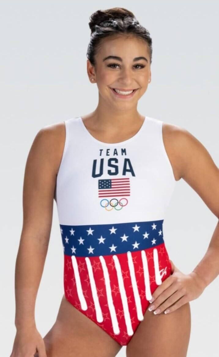
But maybe it’s good that GK Elite did without stripes? So we had a reason to write this text, and to smile once again while watching the artistic gymnastics competitions at the Olympics. Russian athletes will be sorely missed there, but the Russian flag is in one way or another, and also as a result of a chain of important coincidences.
“Of course, I don’t think they saw this magazine and took my idea,” the designer drives thoughts about plagiarism. “It’s just a wonderful coincidence — my swimsuit was in a French magazine, the Olympics will be in France, and also the number is 30 years have passed Well, there seems to be some kind of pride in the state. The Russian designer was the first — no matter how simple this idea was, no one else used it.
This emphasizes how peaceful it is. I am a Russian designer. I have always been a patriot of my country and remain so. But life happened in such a way that I married a Ukrainian, who is an American citizen. Even though we got divorced, I will always speak with warmth. about Ukraine, and about America. I repeat, remaining a patriot of my country. Look, even in design we are so close! I see this as a unification before the start of the Olympic Games.”



















Свежие комментарии